How to Choose Brand Colors That Truly Connect
Color is one of the most powerful tools in branding.
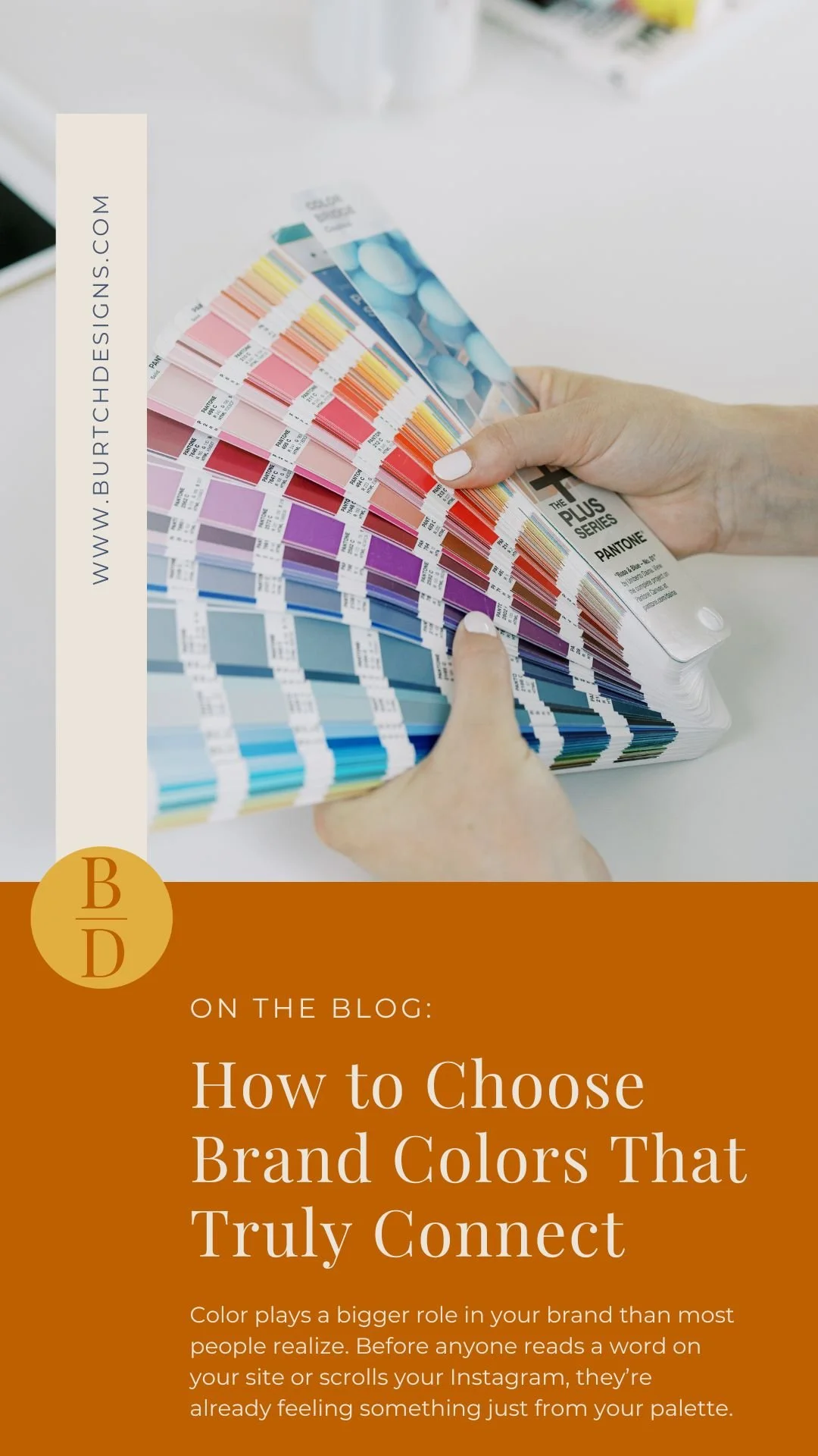
Before someone reads a single word on your website or social post, they’re already forming impressions based on what they see. The right palette can spark emotion, build trust, and create a sense of connection with your ideal clients. The wrong one? It can confuse, overwhelm, or push people away.
So how do you choose colors that don’t just look pretty, but actually work for your business?
Let’s talk about how color influences perception and how to create a palette that feels like you and resonates with the people you want to reach.
Why Color Matters in Branding
We process visuals faster than words. That means your colors are often your brand’s first impression.
They help communicate who you are, what you value, and how you make people feel—all in a single glance.
Here’s what color can do for your brand:
Set the tone: Blue often conveys trust and reliability. Pinks feel soft and approachable. Earthy tones bring warmth and grounding.
Spark emotion: Bright yellows energize. Muted neutrals calm. Deep greens or indigos can feel wise and grounded.
Build trust: A consistent color palette across your website, social, and print materials helps people recognize you and remember you.
Color is more than decoration. It’s a form of communication.
Tips for Choosing a Purposeful Palette
Start with how you want people to feel
Before you think about hues or hex codes, ask this: What kind of emotional tone do you want your brand to set? Do you want clients to feel empowered? Calm? Encouraged? Excited?
Color is one of the quickest ways to evoke emotion. Start there. Let the feeling guide the palette, not the other way around.
I often ask clients to picture their brand as a space. What does it look like? Is it bright and bold, or soft and earthy? Those details give us clues.
Let your brand personality lead
Your colors should tell your story, even before anyone reads a word.
If your brand voice is energetic and confident, saturated or high-contrast colors might fit. If you’re more grounded, nurturing, or minimalist, think soft tones, neutrals, or organic hues.
There’s no one-size-fits-all. The key is making sure your colors feel like you, not just what's trending on Pinterest this week.
Give each color a role
Every palette needs structure. Without it, things start to feel noisy or off-brand.
Here’s a simple framework I use with clients:
• One-two primary colors that anchor your brand and do the heavy lifting
• Two-three accent colors that add personality and variety
• Neutrals (like white, beige, or soft gray) to create breathing roomThink of it like designing a room. You need focal points, supporting tones, and space to let everything shine.
Test in real life
A palette might look dreamy on a mood board. But how does it work on screen? Or in print? Or across your social feed?
Colors can shift depending on the medium or lighting. I always recommend testing your palette across the places your brand actually lives. Website, Instagram, packaging—wherever your clients interact with you. It’s often the little surprises that make or break the palette.
Keep it accessible
Beautiful design should also be inclusive.
Make sure your text is easy to read against background colors. Check your contrast. Tools like WebAIM’s contrast checker can help. This isn’t just about compliance. It’s about making everyone feel welcome in your brand space.
Bringing It All Together
Choosing a color palette isn’t about following trends. It’s about building a visual foundation that feels true to you and helps your clients feel that, too. When it’s done well, your palette becomes a quiet ambassador for your brand. It speaks before you do. It reassures, invites, and connects.
At Burtch Designs, I help female-led businesses choose colors that aren’t just beautiful. They’re strategic, intuitive, and aligned with real growth.
Ready to create a color palette that feels like you and speaks to your people?
Let’s talk about your brand vision and how to bring it to life.