Train Bold. Live Wild:
Refreshing the Jen Brown Fitness Brand
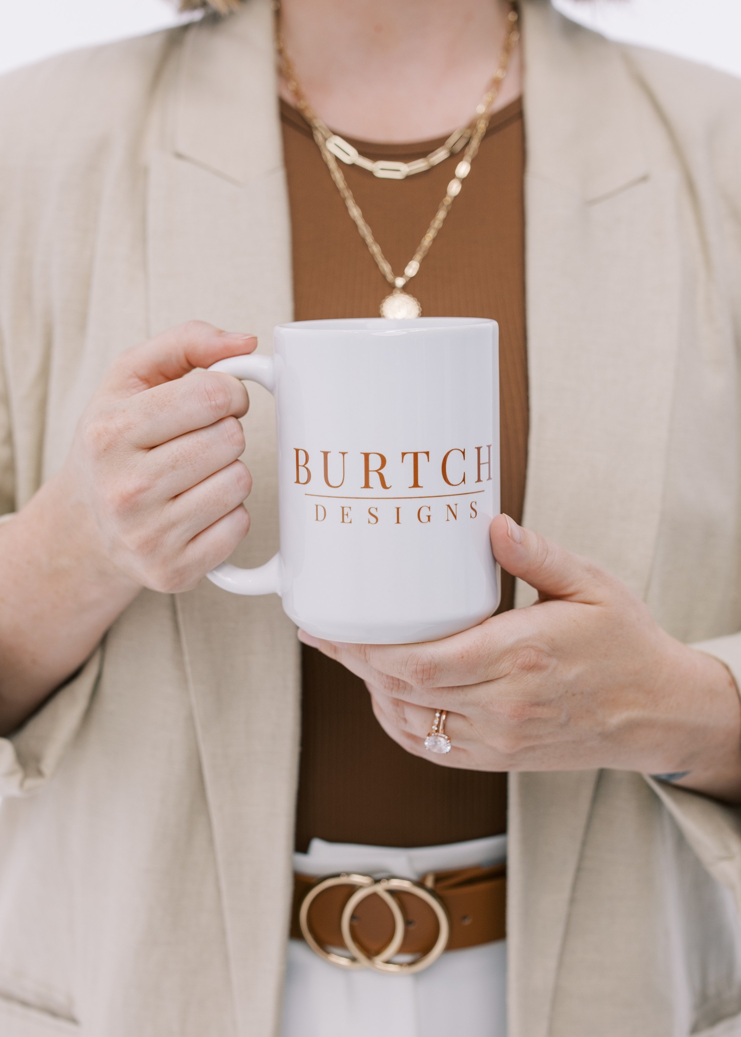
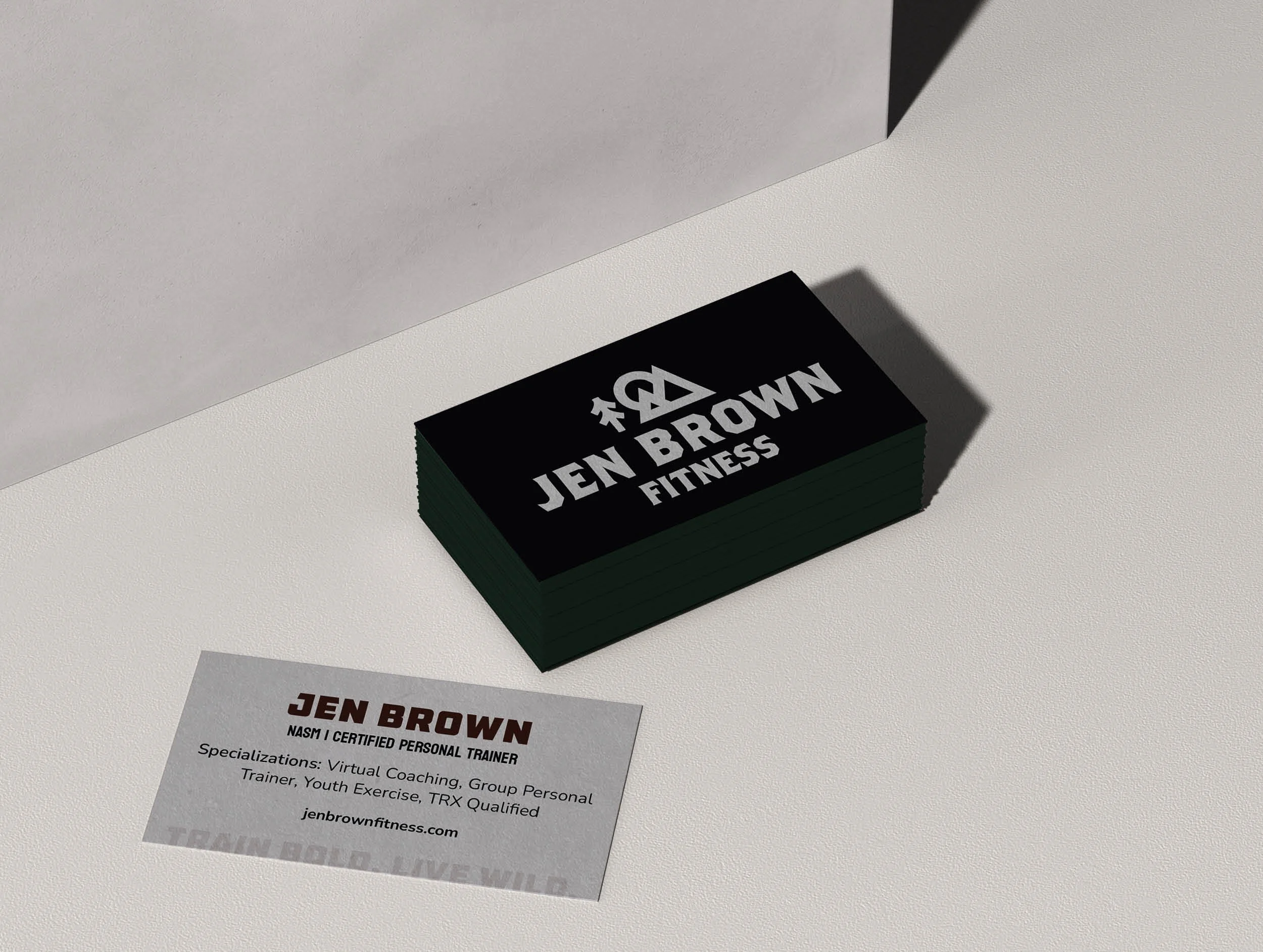
Some projects feel like more than design work—they feel like breathing life into a vision. Refreshing the Jen Brown Fitness brand was one of those moments. Jen already had her logo, but she needed a full system and strategy that would bring her energy and mission to life. Together we created a custom color palette rooted in earthy, bold tones, strong but approachable typography, and a set of brand icons and patterns that add grit and movement to her visuals. These pieces gave her brand a unified look while leaving plenty of room for personality and flexibility.

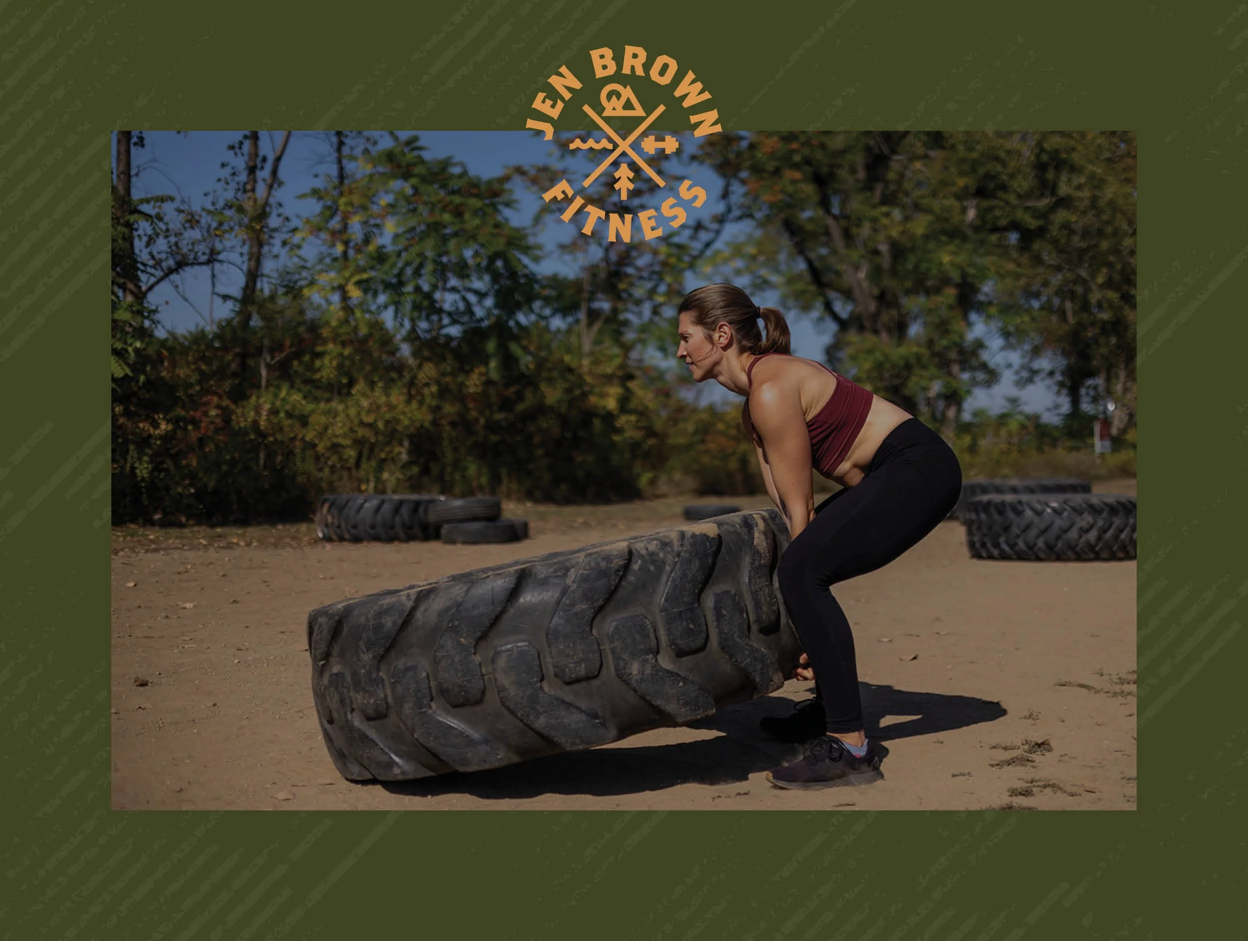
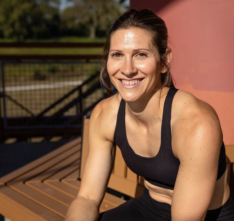
Finally, we redesigned the site itself to be an authentic digital home for Jen Brown Fitness. With new photography showcasing Jen in her element, bold messaging that immediately captures her mission—Train Bold. Live Wild.—and a layout that makes it easy to explore her online and in-person training, the new site doesn’t just look good, it feels like Jen. Strong, approachable, and unapologetically authentic, the brand now meets her clients where they are and invites them into something bigger than just a workout plan.
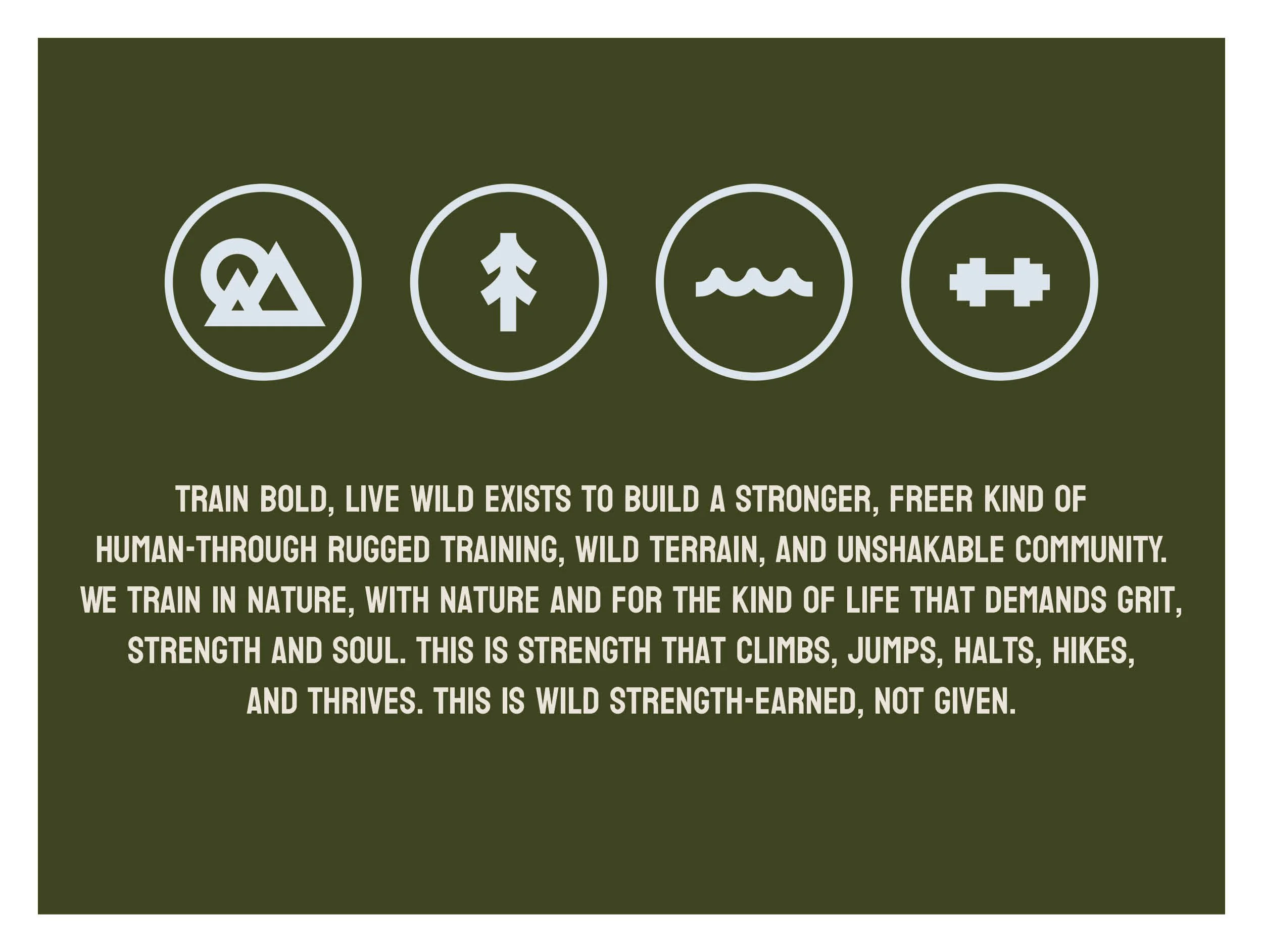
We also took a step back to rethink the strategy behind her programs. Jen’s coaching had evolved into something bolder and more community-driven, but her program names didn’t reflect that yet. Through our work together, we renamed and restructured offerings so they feel aligned, clear, and true to the grit and freedom Jen inspires in her clients. This strategic layer became the backbone of her new website, ensuring visitors not only understood her services but also felt invited into a movement.

–Jen Brown, Jen Brown Fitness
“Working with Burtch Designs on the redesign of my Train Bold. Live Wild. website was the most amazing experince. Jackie truly captured the spirit of my brand and brought it to life in a way that feels bold, clean, and aligned with my vision. She was flexible and willing to pivot when I needed to, which made the process smooth and stress-free. It is exactly what I needed. I am so grateful for Jackie and how she captured the heart and authenticity of my brand. She didn't just redesign my site, she elevated my brand.”
Why this matters
When your brand reflects the care you put into your work, everything shifts.
You stop second-guessing how you show up.
Your audience understands your value faster.
And your business has room to grow—without outgrowing your brand.