Unbound Pelvis
An elevated brand refresh for a pelvic floor therapist
Where We Started
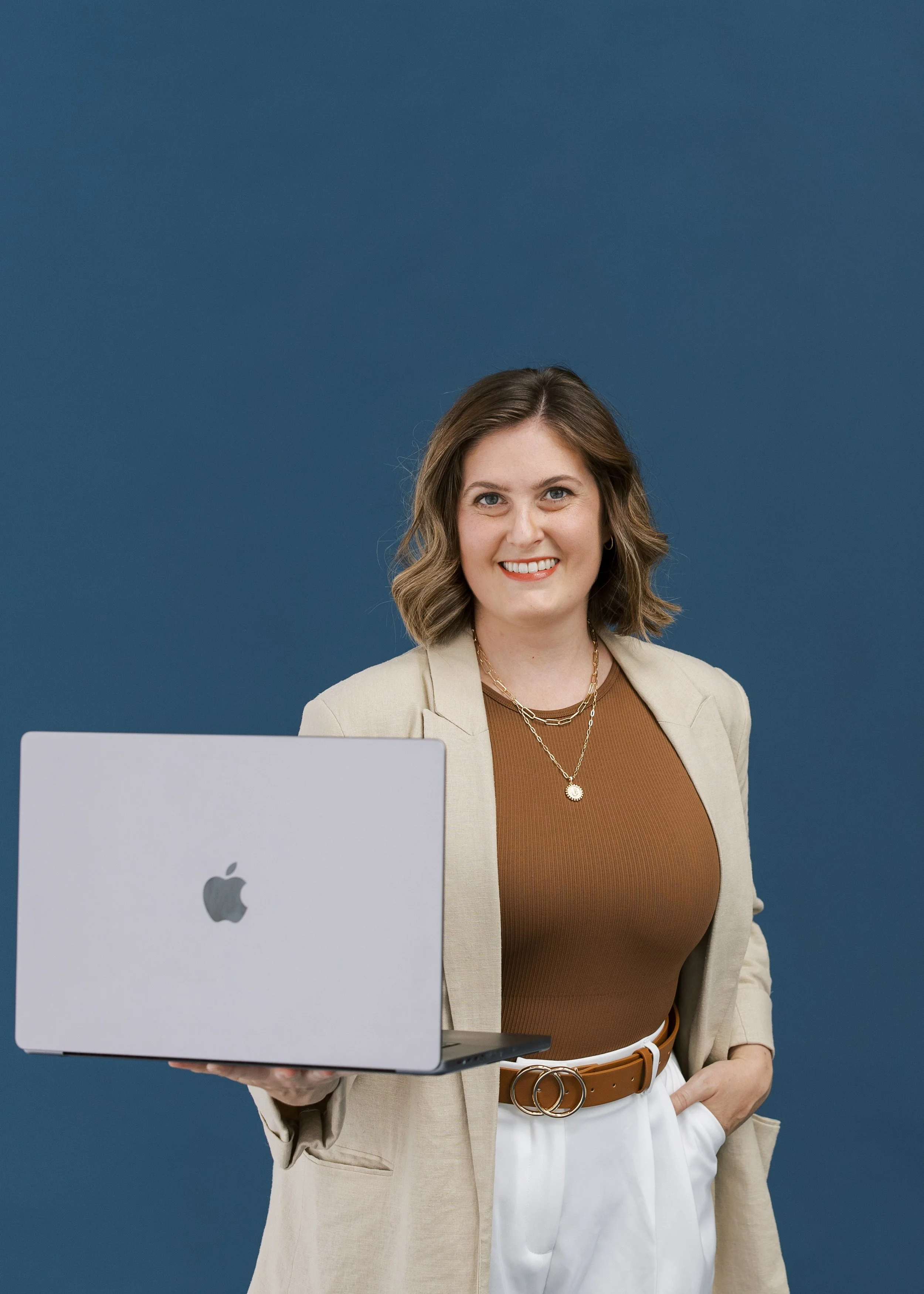
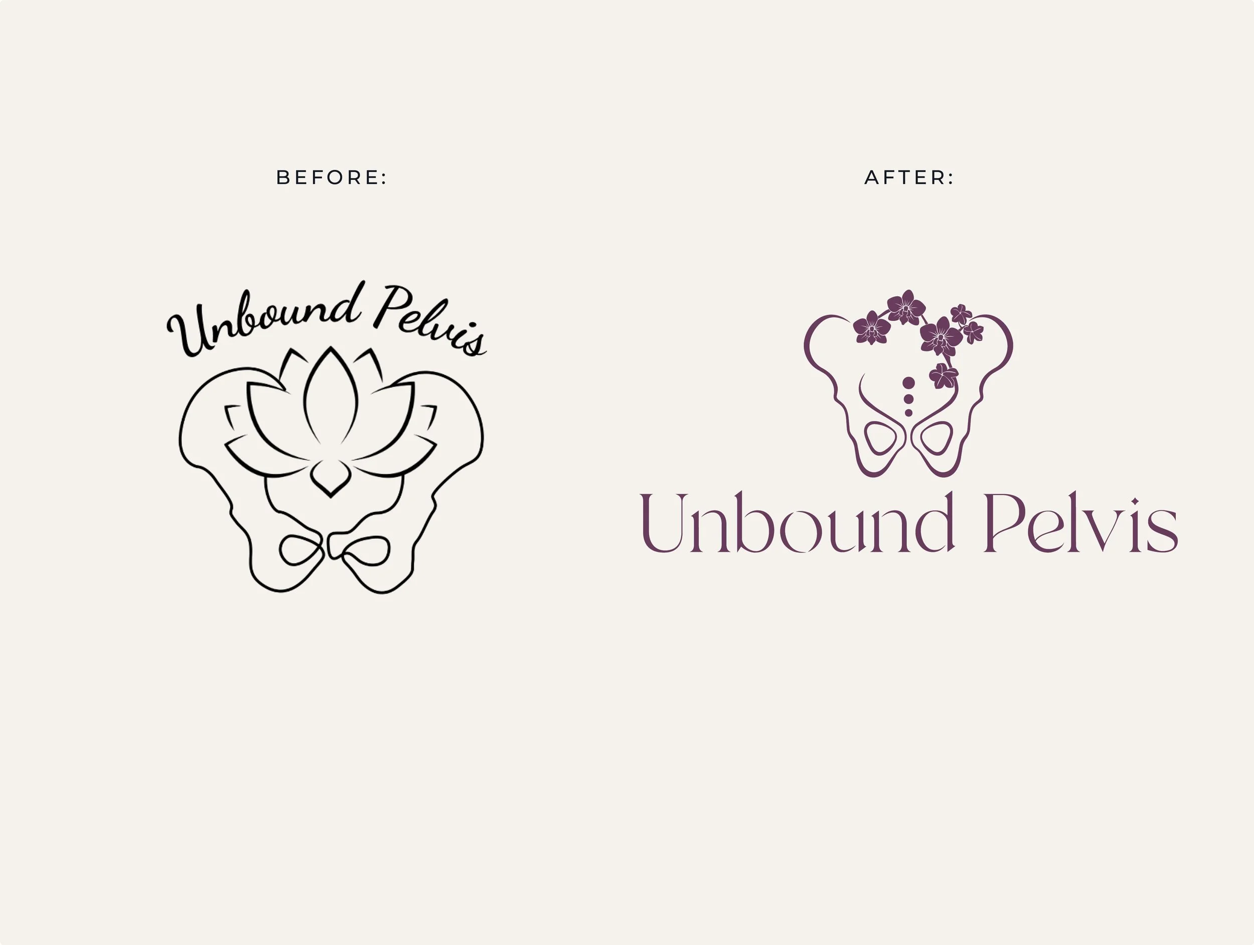
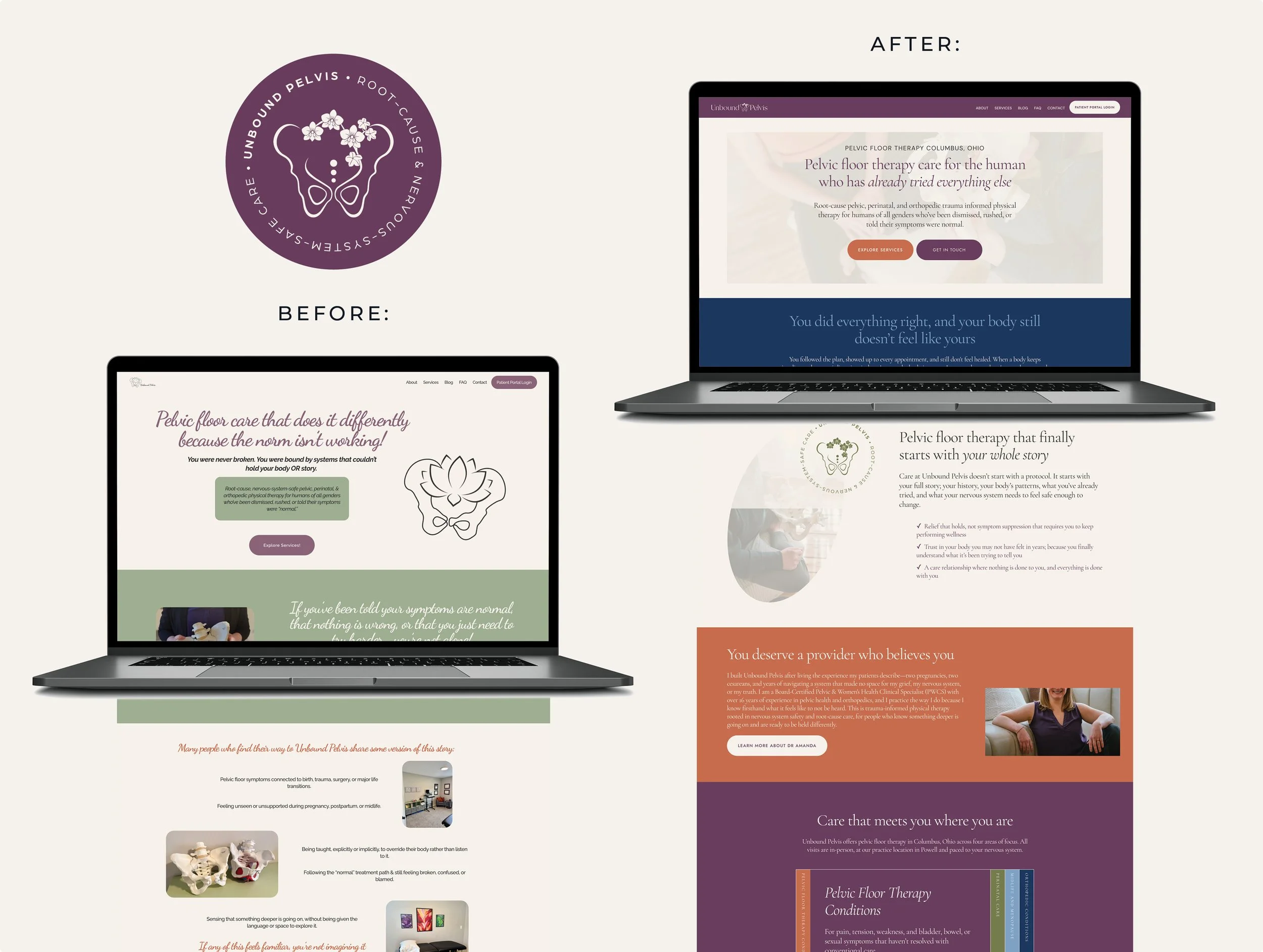
Dr. Amanda Townsend built a practice for the patient who had been cleared but not healed, dismissed, handed a home exercise program, and sent on their way. What she didn't have was a brand that said that out loud. The existing logo had two different illustration styles that never felt cohesive. Amanda felt that disconnect every time she shared her website or handed someone her card. Beyond the logo, nothing in the brand was doing the work of saying who she was actually built for: the neurodivergent human that had been dismissed by provider after provider, seeking acknowledgement and understanding.
The Work
We started with competitive research across three local Columbus competitors and landed on a clear truth: none of them were speaking directly to the dismissed, trauma-carrying, neurodivergent patient. That was the white space. From there we built an ideal client persona and worked through what she believes about her body, what she's been told by providers, and what she assumes before she ever books. Her emotional arc, from dismissed and fractured to heard and whole, became the architecture for everything that followed.
The biggest visual decision was replacing the lotus with an orchid — and it wasn't just aesthetic. Pediatrician Dr. Thomas Boyce spent nearly four decades researching what he calls orchid children: highly sensitive, biologically reactive individuals that when given the right conditions, can thrive beyond their peers. Orchids aren't failed dandelions. They're a different kind of person entirely, one who needs different soil. That discovery and understanding moved the mark from generic wellness imagery to something ownable, specific, and rooted in her work.
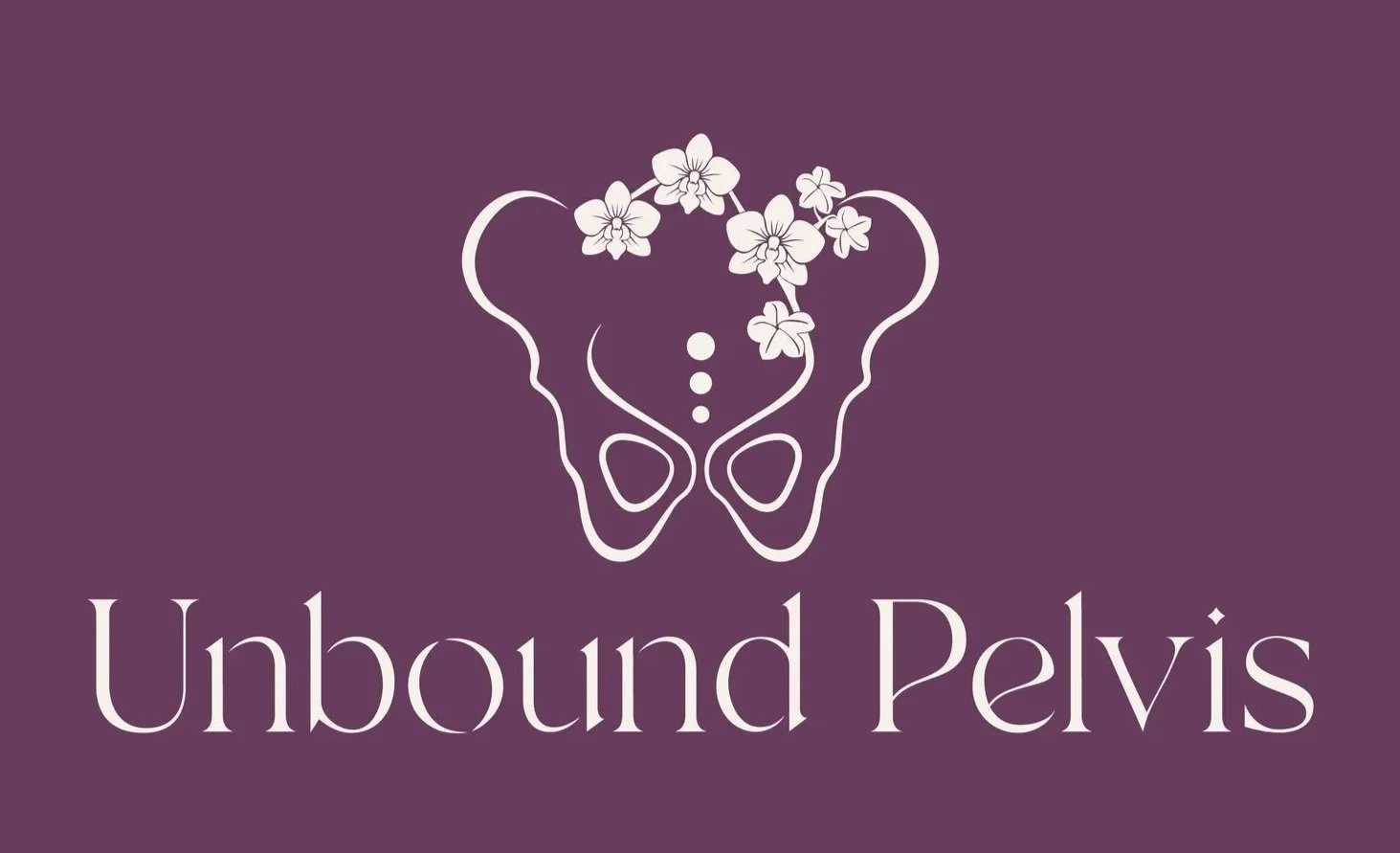
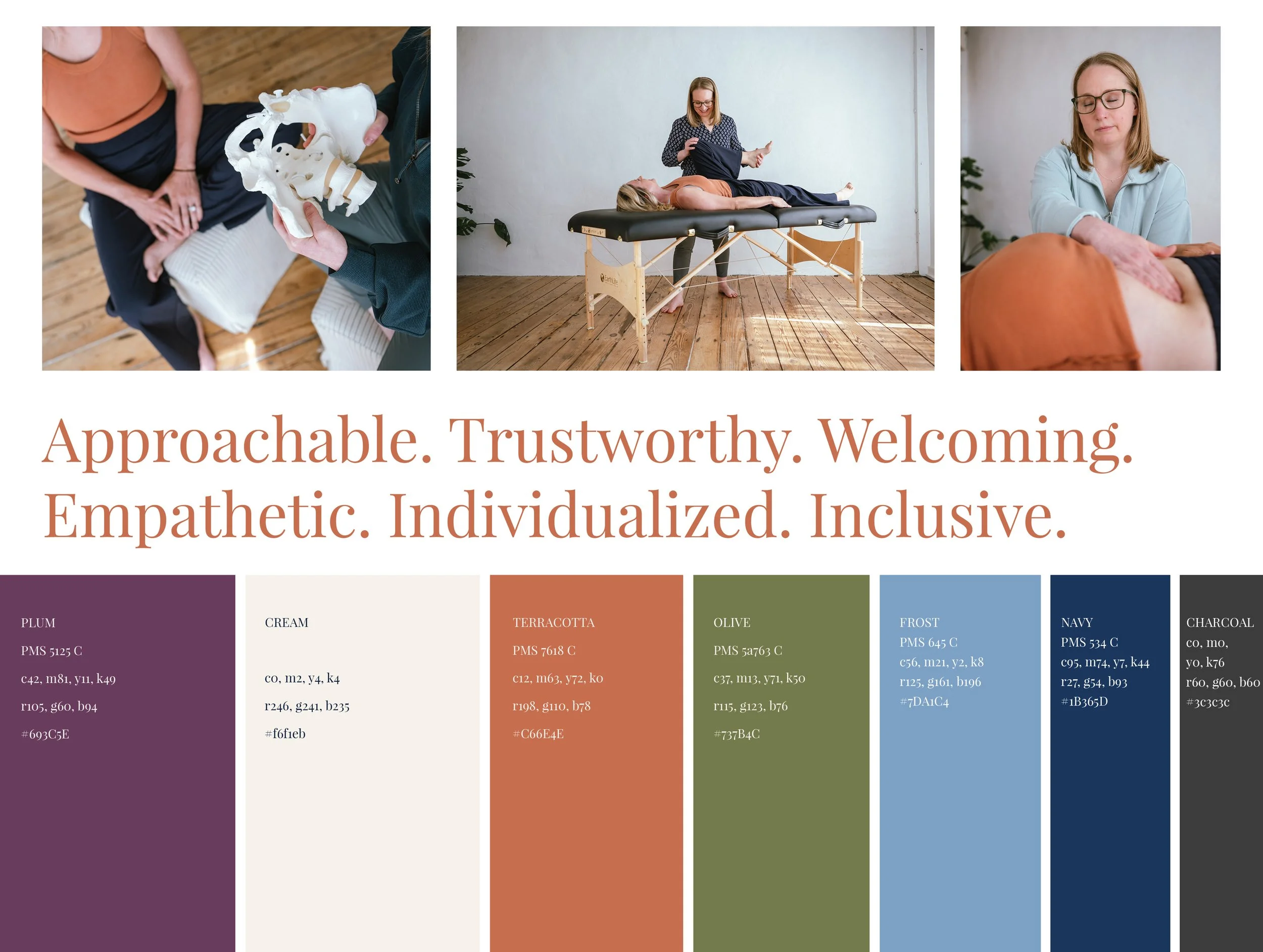
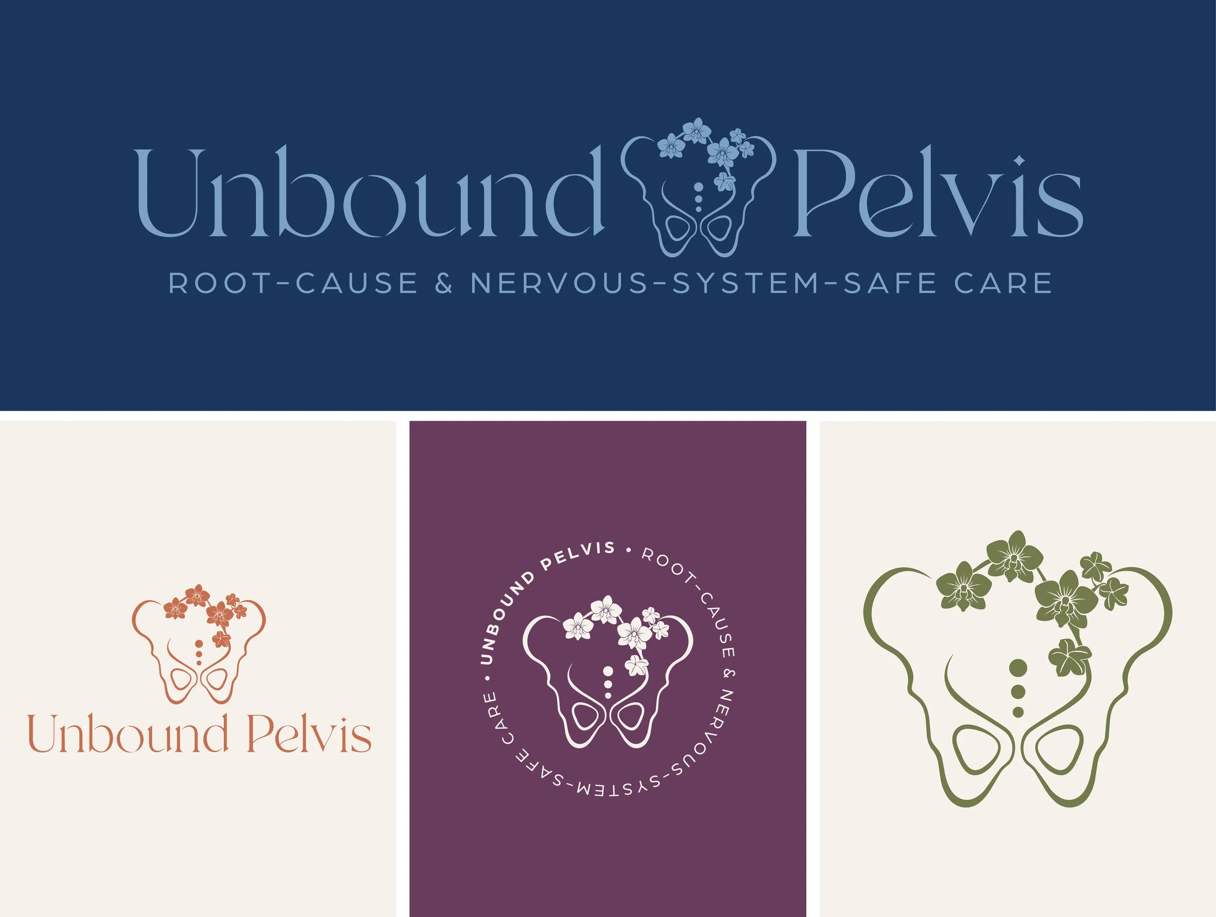
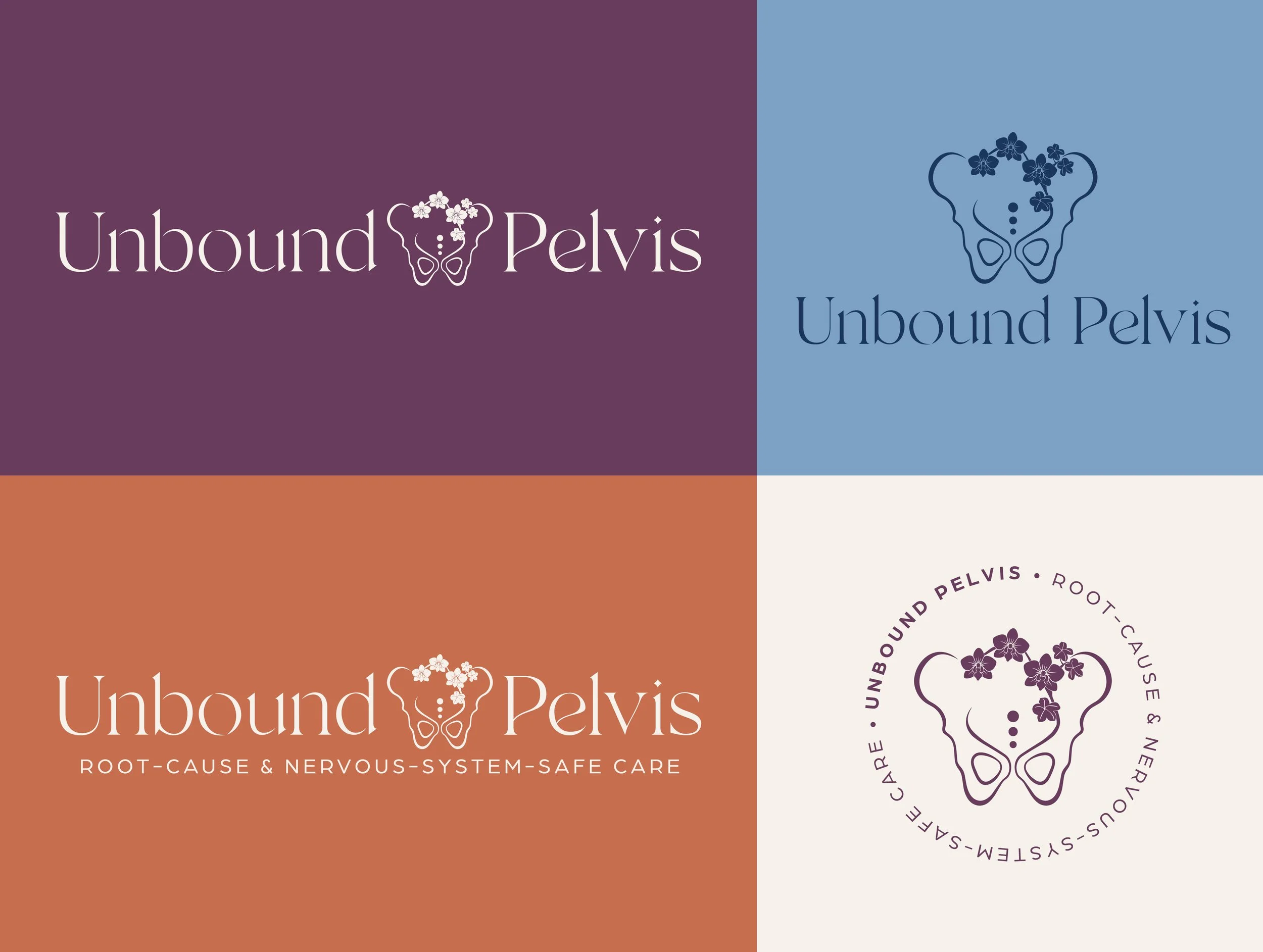
The orchid illustration uses variable-weight line work with strokes that swell and taper like a brush on paper rendered as solid filled blooms against the open structural line of the pelvis beneath. The color palette evolved rather than changed: terracotta and cream stayed as the anchor, with plum, frost, olive, and navy to round out the color palette. The wordmark has one quiet detail worth noting: the 'o' in Unbound doesn't close. The unbinding lives in the letterform itself.
The full logo system includes four marks, with a stacked primary, a horizontal wordmark, a circular badge seal, and a standalone illustration. Each of these iterations have a clear job to do. The brand pattern tiles the pelvis-orchid mark at a consistent scale, becoming a completely different asset in color.
The Result
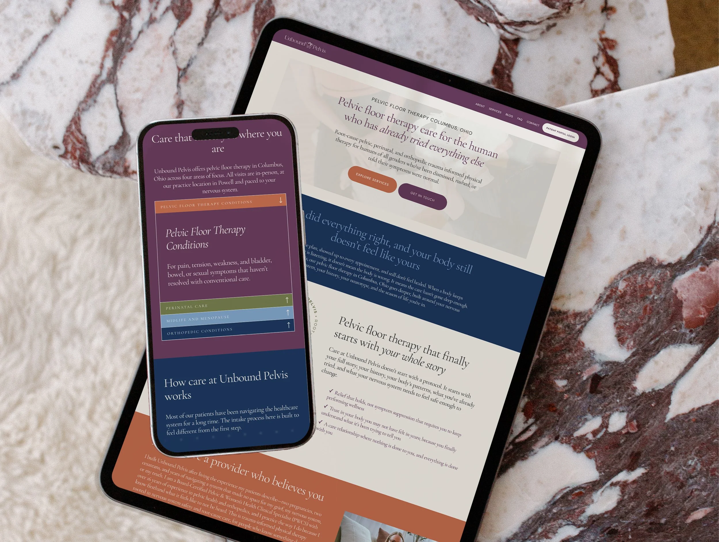
Unbound Pelvis now has a brand that does what the practice does: it listens before it speaks, it holds before it fixes, and it makes the right person feel seen before they ever books an appointment. The orchid, the open letterform, the elemental palette, the copy built around the dismissed patient create a brand that allows her ideal client to feel seen, heard, and valued before they even talk to her!
The Takeaway
When the brand finally matched the philosophy, everything clicked — the illustration, the copy, the ideal client, the white space in the market. Dr. Amanda always knew who she was built for. The work was making sure everyone else could see it too.
Ready for a transformation like this?