
HiveHouse Family Solutions
Sophisticated branding for a nanny & household support agency
A premium service hiding in a commodity category
HiveHouse offers something genuinely different from other nanny agencies — full end-to-end management of hiring, payroll, onboarding, and ongoing caregiver support. But in a market where competitors look like booking apps and hourly staffing services, that distinction wasn't coming through.
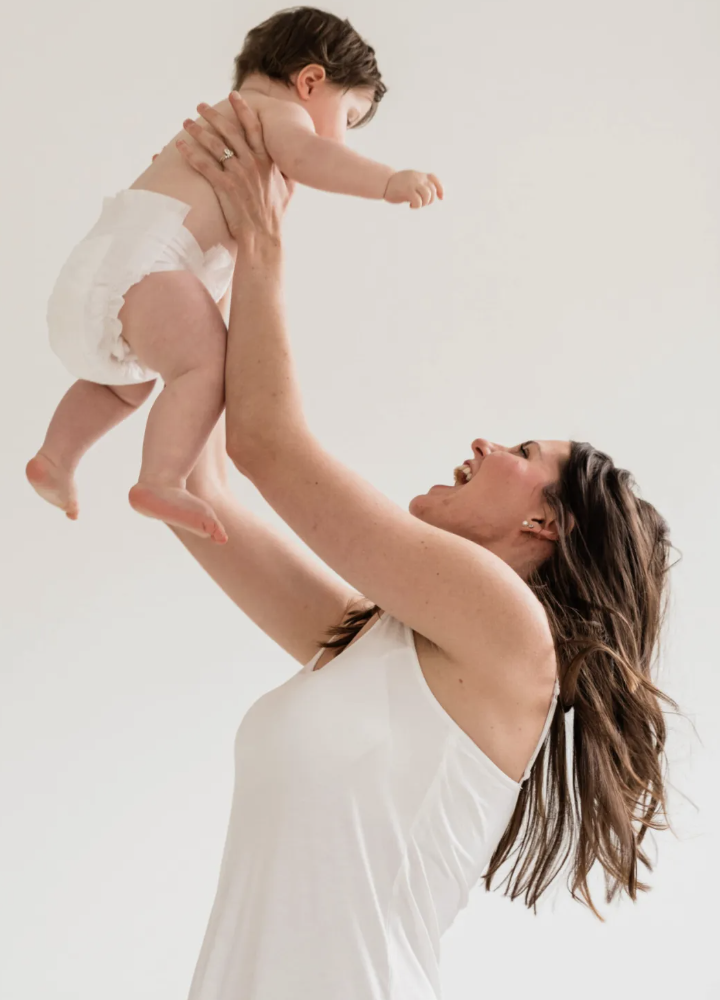
The brand needed to signal premium without feeling cold, and build trust with two very different audiences: the high-achieving working mom who can't afford childcare chaos, and the business owner who needs a retention-ready employee benefit that doesn't add HR burden.
The differentiator was already there, it just needed naming.
Competitive research revealed that both competitors operate as coverage models — flexible, hourly, platform-style. Neither owns the fully managed employment relationship. That's HiveHouse's lane, and it's a significant one.
For the working mom, this means no more vetting, second-guessing, or bracing for emergencies. For the business owner, it means a turnkey retention benefit with no operational burden. Same differentiator, two entirely different stories to tell.
Refined, editorial, quietly premium
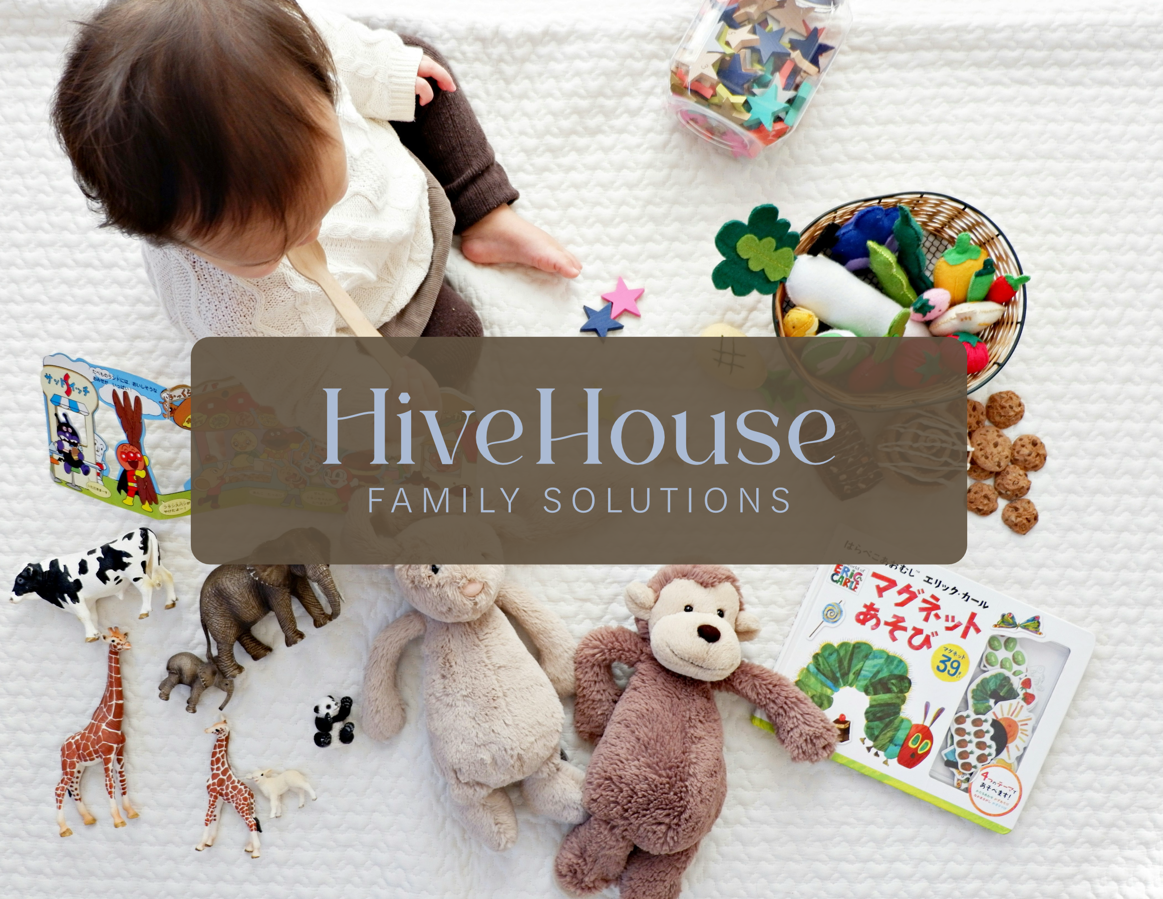
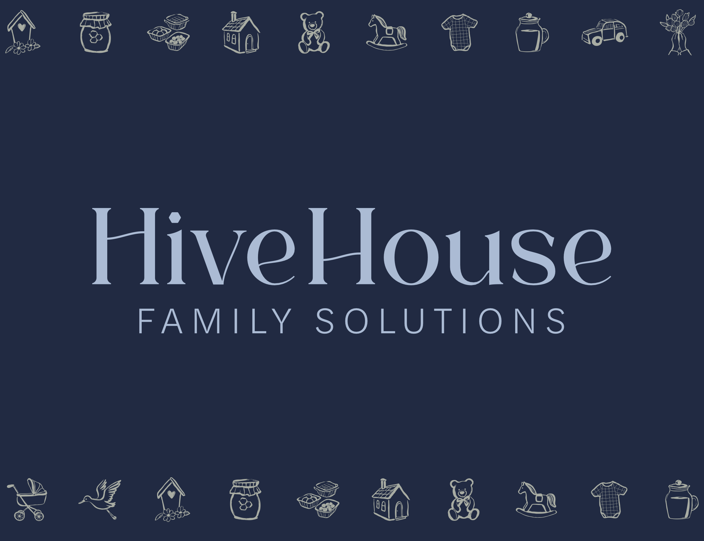
The mood board landed on a clear aesthetic: a classic elevated wordmark with a simple monogram, high-contrast serif typography, generous spacing, and a clean hierarchy where the name is the hero. The supporting illustration style leans vintage line-etching — warm and personal, without ever feeling kid-centric.
–Emma Lockyer, Founder of HiveHouse Family Solutions