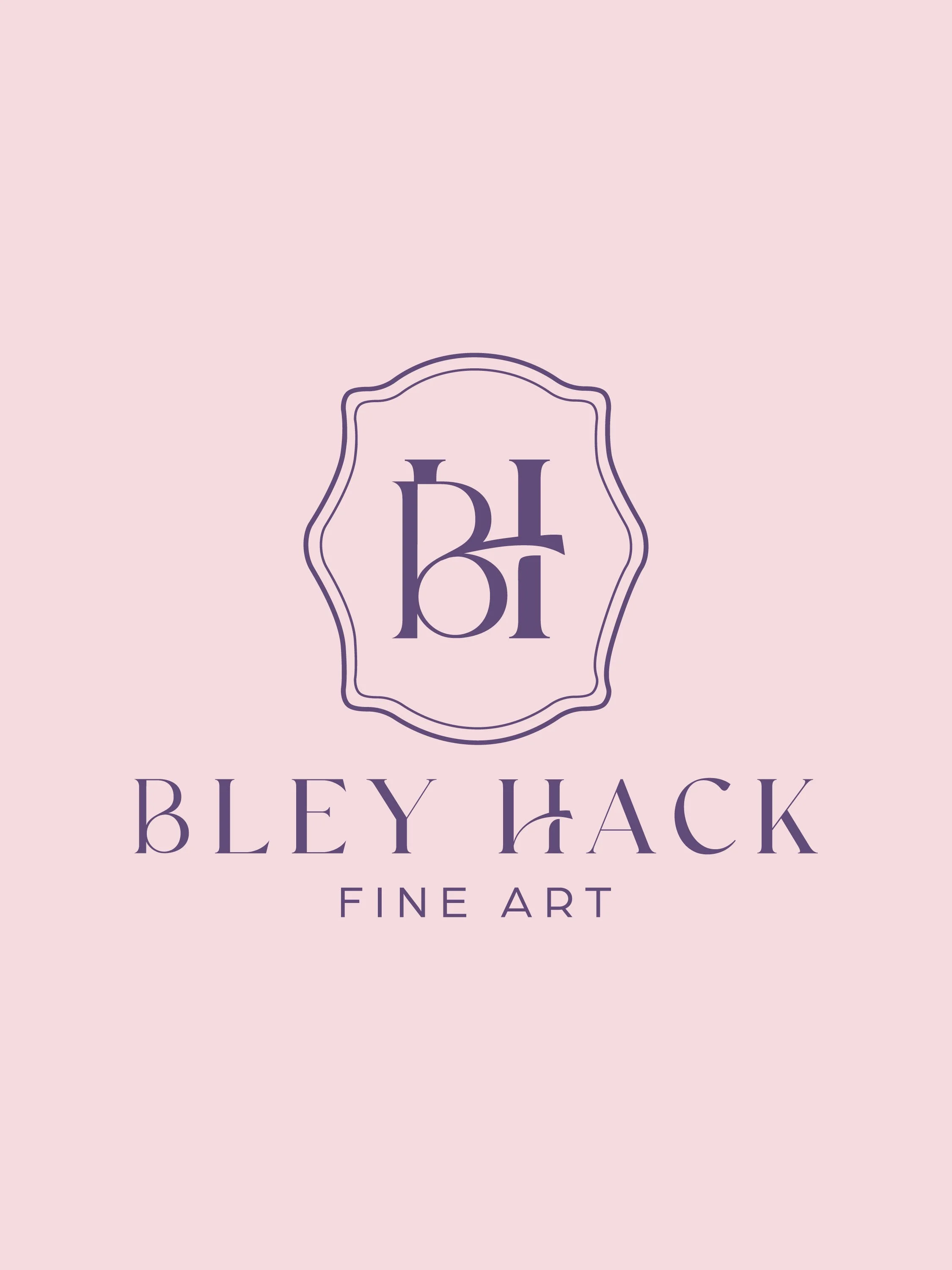
Bley Hack Fine Arts
Rebranding an artist with an eye for color
Bley Hack is a watercolor and oil painter whose studio sits on a family farm — a woman whose work carries warmth, beauty, and a rare kind of personal resonance. But her brand didn't say any of that. Like many working artists, she was describing what she made, not why it mattered.
Her existing positioning "timeless hand-painted artwork for family homes" was accurate but invisible. In a crowded market of talented painters, competence isn't a differentiator. Emotion is. We were brought in to find the emotional center of Bley's brand and build everything around it.
Discovery
Brand heart. Market research. Audience persona. We mapped Bley's why, how, and what — and studied her competitive landscape to find her genuine opening.
Three phases, one coherent story
•
•
Messaging
Brand voice. Feeling. Impact. Value proposition. We articulated what sets Bley apart — and how to say it in a way her ideal client immediately recognizes.
Vision
A mood board and five curated color directions. We translated all strategy into a clear visual brief — refined, artful, and gallery-inspired.
Heirloom · Refined · Artful
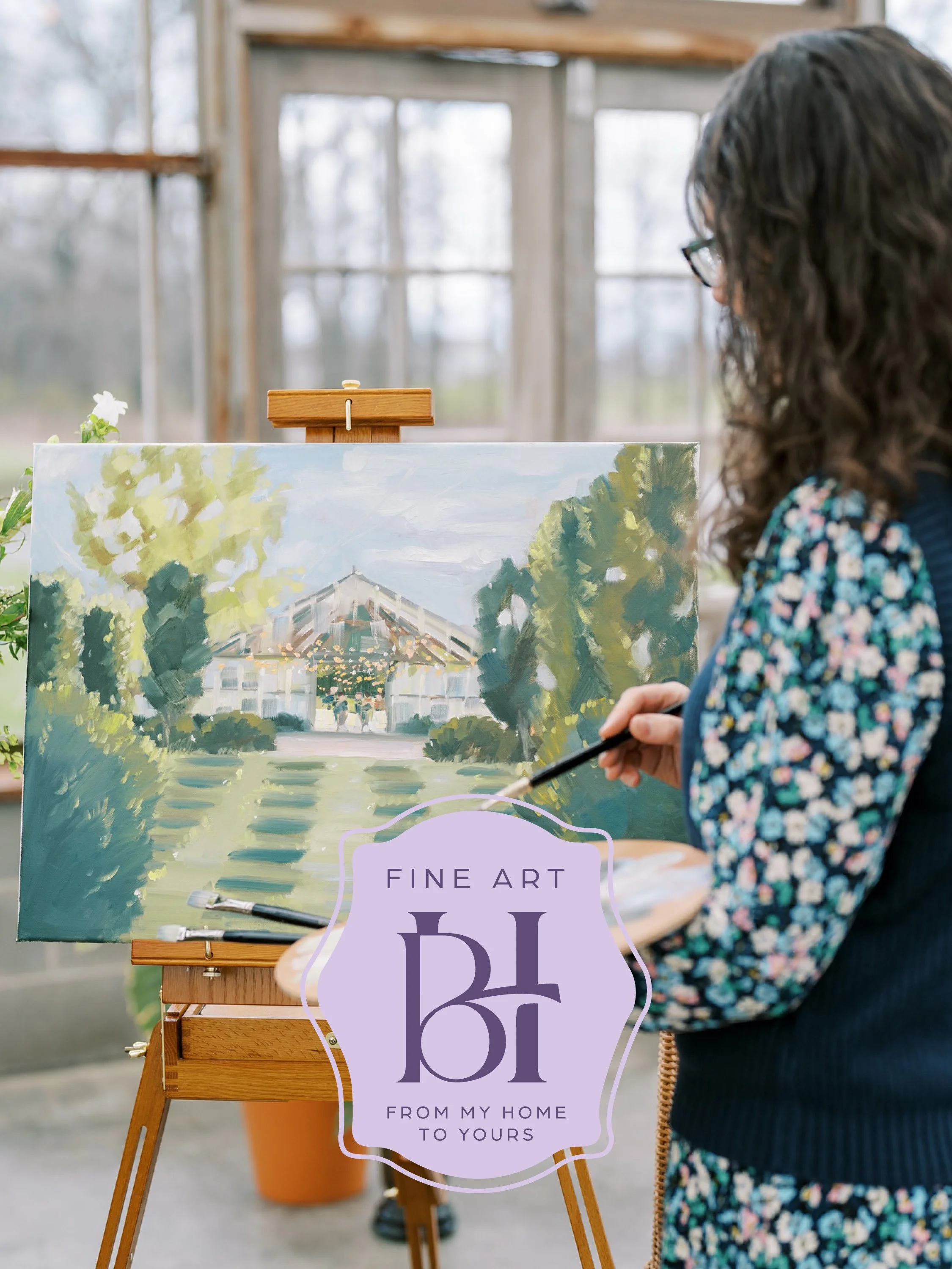
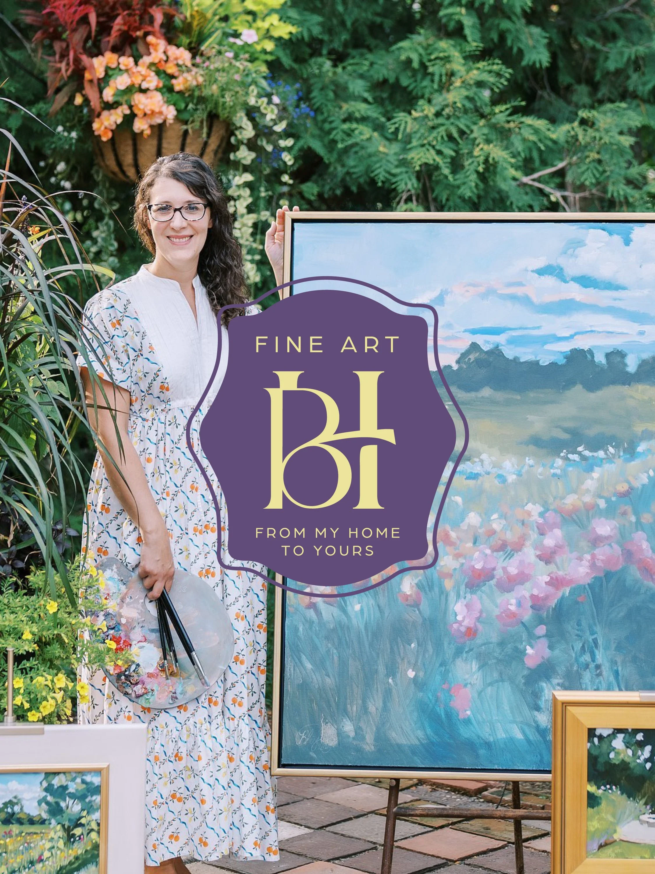
The mood board landed on a clear aesthetic: quietly confident, gallery-inspired, personal without being precious. We recommended a serif-led wordmark or refined monogram with subtle hand-touched details that signals craft without loudness.
Bringing beauty and personal connection into the home through art
Why
Creating warm, heirloom-worthy pieces shaped by beauty and connection
How
Artwork and commissions for women building intentional homes
What
Why this matters
When your brand reflects the care you put into your work, everything shifts.
You stop second-guessing how you show up.
Your audience understands your value faster.
And your business has room to grow—without outgrowing your brand.