
7 Brand Identity Examples to Inspire Your Brand Refresh
You’ve put endless effort into your business. You’ve got the products lined up, and your customer service is on point. But when it comes to your branding, it’s just not cutting it.
Maybe you’re going for a refresh. Maybe you’re going for a complete rebrand. Either way, you’ve started searching for a unique, recognizable brand identity that doesn’t feel out of reach or out of touch.
Small business branding can be fun, and it should feel relatable! This guide shares visual and real brand identity examples for small businesses that I helped create. Keep reading to find your perfect inspiration.
Looking for Brand Identity Inspiration? Start With Real Businesses.
It’s natural to start your rebrand by looking at examples. You want to discover what branding success actually looks like. But! When you start to base your branding strictly on companies like Nike, Apple, and Coca-Cola (giants that have had years to develop and adjust their branding), it can leave your branding feeling flat and impersonal.
I find that branding examples from small businesses are often more useful. Companies like The Educated Pelvis, Bakes by Lo, elh&co, and Flourish and Focus ADHD show how your brand identity can reflect your audience, personality, and your business goals.
First, What Makes a Strong Brand Identity?
Before you dive into fun colors and designs, gather brand identity information to build a strong foundation that supports your business for years to come.
It's More Than a Logo
Yes, your logo will be the most recognizable part of your brand identity, but it’s not the only part of your brand. A strong logo reflects your personality and unifies your image across emails, websites, and print and in-person materials.
Every Element Should Tell the Same Story
Your fonts, colors, attitude, messaging, and imagery show your audience what you’re all about! Keeping these elements consistent across all platforms gives your audience a clear, memorable impression of your brand.
Your Identity Should Feel Distinctly Yours
Both you and your audience are unique, so be careful not to get too swept up in your inspiration. I recommend taking the bits and pieces you like most and twisting them into a fresh perspective that feels personal to your business.
Strategy Comes Before Aesthetics
Trends can be tempting, but they don’t last, and you want your business to stick around. I treat brand building as a chance to convey who you are, what you offer, and who you want to attract. It’s more than looks.
7 Brand Identity Examples to Inspire Your Rebrand
These visual brand identity examples are my first-hand rebranding projects, built on both strategy and style.
Brand Identity Example #1: The Educated Pelvis
Creating a Brand That Reflects Inclusive, Intentional Care
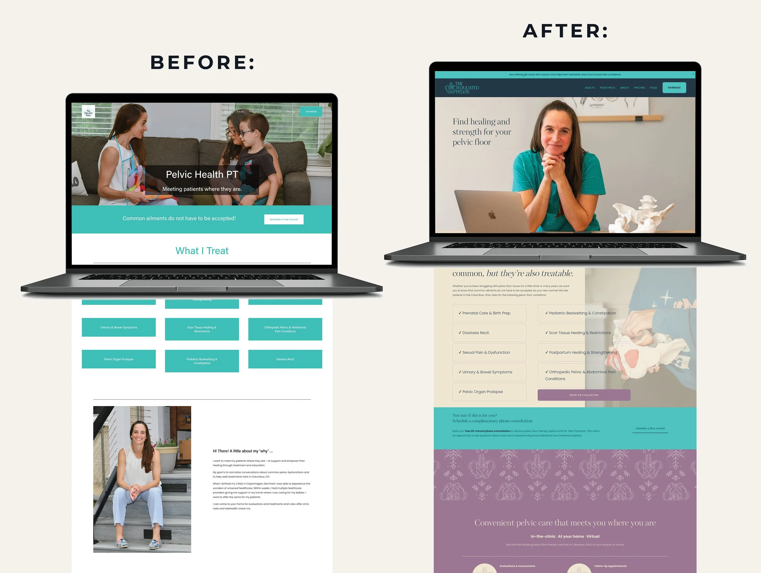
The Educated Pelvis provides assessments and evaluations for a variety of pelvic floor issues. Its previous identity, especially the white background, felt sterile and generic for a healthcare brand. Instead, I aimed to shift the identity to a calmer, more welcoming presence.
This involved removing the harsh white background, adding design elements, and updating the typography. The sharpness of the previous look was then replaced by a much gentler appearance. For the logo, the goal was to convey trust and professionalism, so I simply realigned the words (in keeping with the new fonts!) and used thinner linework.
Throughout this redesign, my goal wasn’t to completely change the company's look, it was to shift the style to reflect the care the brand now provides. As you redesign, remember that your brand should reflect the business you've become, not the version you started with!
Brand Identity Example #2: Bakes by Lo
Giving a Local Bakery a Brand as Memorable as Its Products
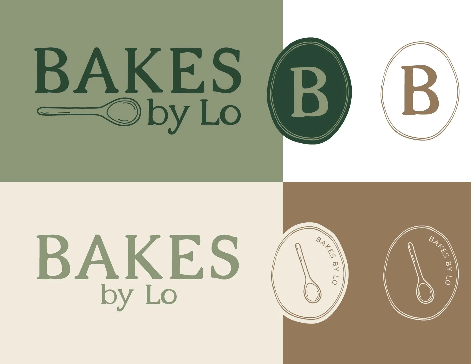
Bakes by Lo is a small bakery business built on care and consistency. When working with this brand, the goal was to unify their digital and in-person presence and prepare the company to move into a brick-and-mortar location.
The key with Laura’s identity was giving customers a feeling before they ever made a purchase. I chose neutral, earthy tones and neat, handwritten-quality fonts to emphasize the brand's welcome-home nostalgia that customers already loved. The images reinforce this by supporting business values, featuring old-school utensils rather than high-tech machines.
Beyond the logo, this redesign extended to packaging, signage, and social content to reinforce the in-person customer experience. I was proud to help Laura move away from the Canva-esque feel of their previous branding and support their new, more ownable space.
Brand Identity Example #3: Bobbie's Shoppe

Using Personality to Create a Brand People Remember
Your brand personality is unique to you, making it a powerful tool for differentiation. For Bobbie's Shoppe, I highlighted the sophisticated yet welcoming personality to keep them from blending into their category of gifting.
I helped Georgia build her visual direction to blend both professionalism and fun. With custom fonts and intentionally saturated colors, Bobbie’s branding shows a creative flair that’s refined enough to represent both the brand and its products.
For small businesses with a personality like Bobbie’s, remember that “professional” doesn’t have to mean “predictable.”
Brand Identity Example #4: elh&co
Making a Specialized Business Easier to Understand Visually
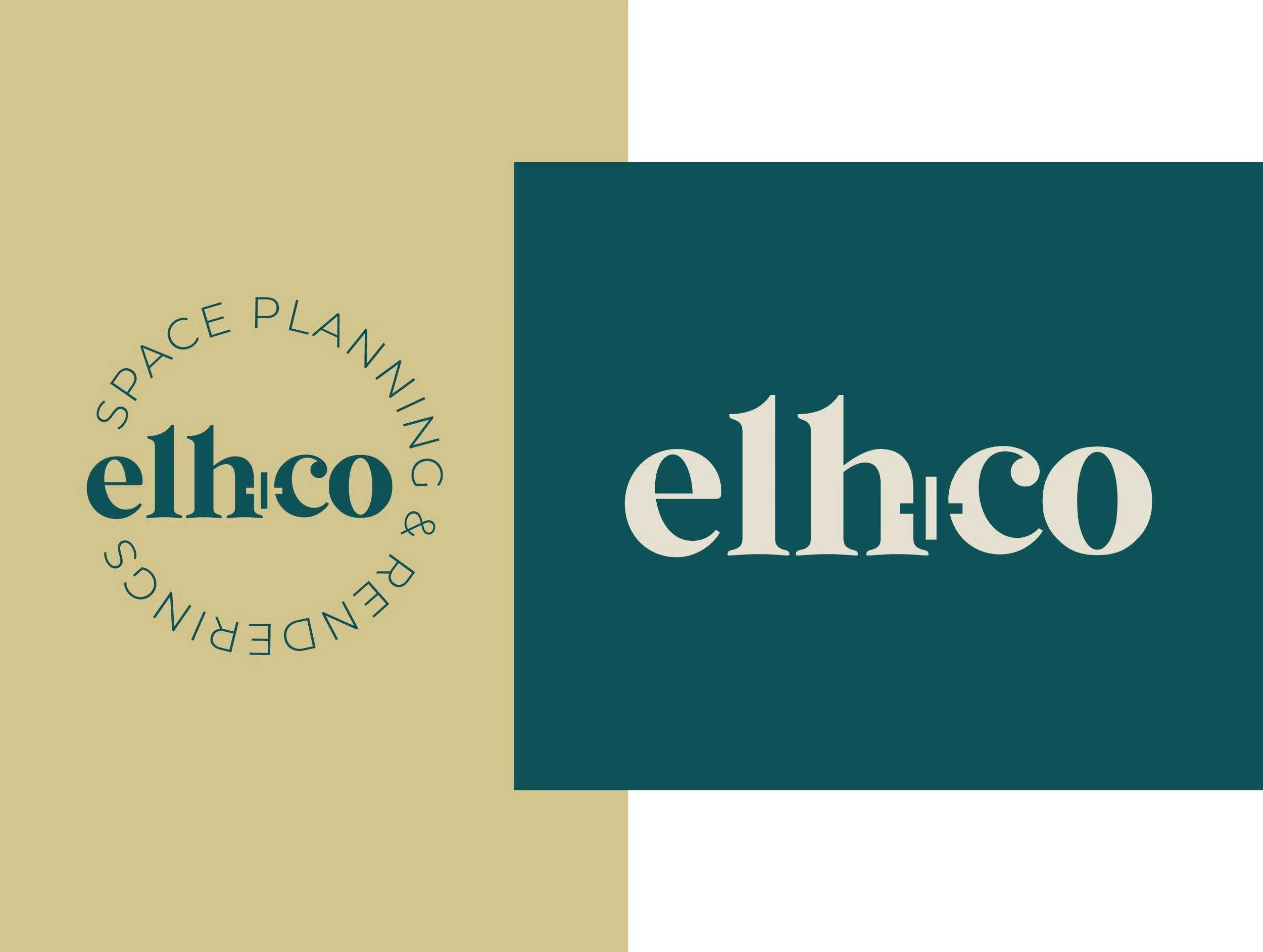
elh&co is a space-planning company that makes interior design and remodels easier. They work with interior designers and homeowners to create 3D mock-ups and models of real spaces. The challenge? Designing a brand that explains all of that without overcomplicating it.
For technical or specialized offerings like Erin’s, branding can communicate a simplified, concise message that explains everything. I find that visual hierarchy and clear imagery are especially important here. A neat, tidy brand identity builds credibility. Pair that with intentional typefaces and unique colors for visual interest, and you can also convey the brand’s personality!
Above all, your brand identity should support your positioning. If your company is a tool for clarity, communication, and design, your identity should reflect all three!
Brand Identity Example #5: Spiral Path

Building Trust Without Looking Like Every Other Wellness Brand
We all know the usual wellness branding: whites, clinical or condescending tones, and an occasional pop of color for some emotion. With Spiral Path Counseling, I wanted something more. Spiral Path specializes in anxiety, trauma, and PTSD for those who have tried looking inward a time or two before.
With this positioning, Spiral Path’s rebrand was about creating an identity that feels welcoming and credible. Using typography and color psychology, I chose unique fonts and bold colors to differentiate this practice.
Additionally, the Spiral Path logos offered a chance to stand out from the industry's visual clichés. By using spiral imagery, the brand’s identity becomes not only differentiated but memorable (crucial for small-business branding!).
Brand Identity Example #6: Labyrinth Health Integration

Turning a Bigger Brand Idea Into a Cohesive Visual System
I’ve found that the strongest brand identities have a reason behind the details. Labyrinth Health Integration is all about navigating life’s twists and turns, from identity to illness. Growth, navigation, connection. These are all pieces of Labyrinth’s identity.
This brand design aimed to visually reinforce these concepts while also uniting them through symbolism and color. Many therapy and life coaching companies exist, but through these elements, Labyrinth landed on branding that feels unique, but also unified and accessible.
Brand Identity Example #7: Flourish & Focus ADHD Services

Designing a Brand Around the People It Needs to Reach
One thing I’ve learned over the years is that your favorite aesthetic isn’t necessarily your best way to brand. Remember to design for the people you’re trying to reach. Flourish and Focus’s branding does just that.
Aimed toward women living with ADHD, Flourish and Focus needed to balance professionalism with accessibility. By choosing calm blue and green tones, minimalist typefaces, and visually interesting photography, I wanted the brand to pique interest without becoming overwhelming, ideal for ADHD audiences.
Additionally, the graphics included throughout the website and brand guides give the company a specialized, feminine edge while remaining appropriate for its field.
What These 7 Brand Identity Examples Have in Common
Each of these brand identity design examples has a particular visual style. However, they all use key design and branding elements that make them successful.
Strategy Before Design
Starting with the most important: strategy. Each of these visual identity examples puts strategy behind every part of the design and answers questions like, “Who am I reaching?” “What am I selling?” and “What values do I want to portray?”
A Clear Brand Personality
To get to the right strategy, I have to understand a brand’s personality. These brand design examples work because they have a clear, identifiable personality that comes across quickly. Your brand could be fun and outgoing, emotional and supportive, or even sophisticated and regal. Whatever it is, let it shine!
Consistency Without Sameness
We’re all sick of boring branding. What these small businesses have in common is consistent, united visuals across socials, their website, and in-person engagement. But! It’s not a template, copy-and-paste feel. It’s about a clear, interesting point of view between every touchpoint.
Visual Choices Made for a Reason
Aesthetics and preferences aren’t leading the design here, the business and the brand are. Across these brands, every visual element is chosen intentionally to reflect their personal values, products, and audience.
Enough Flexibility to Work Beyond the Logo
As I’ve mentioned, your logo is the most recognizable part of your brand. However, limiting yourself to your logo limits your possibilities. These small business branding examples all use their logo as a launchpad for their overall brand guidelines (key to building lasting, engaging branding!).
How to Use Brand Identity Examples Without Copying Them
As you research for inspiration, keep in mind that you’re not looking to take over the surface-level aesthetics of other brands, but rather observe the strategy that’s making them work.
Identify What You Respond To
Notice patterns in your observation. Bold colors, eye-catching fonts, minimalist designs, or a tailored tone of voice are all elements you might feel drawn to for your personal branding.
Ask Why It Works
Once you notice what sticks out, ask yourself why. What are the functional reasons for that design? What does it tell you about the brand? Can you use the feature in a similar way? Look to understand how visual style serves the business’s goal.
Separate Inspiration From Imitation
Instead of stealing color palettes or logo layouts, look for ways that brands solve creative problems that your business also faces. After all, branding is about creativity and problem-solving, things that are unique to your brand. Plus, copied branding often feels flat and impersonal.
Build Around Your Own Audience and Positioning
Once you understand the design elements you resonate with and the way other brands use them, it’s time to start building! Take a closer look at your personal mission and the type of people you want to reach. How will these elements help you achieve your specific goal?
5 Signs You're Ready for Your Own Brand Refresh
Whether you’ve been around for months or years, intentional branding guarantees your brand’s appearance matches your current level of success.
Your Business Has Outgrown Its Original Branding
One of the most common times to rebrand is when your business offers different products, services, or pricing than when you first started, or when your audience has significantly changed since launch.
Your Visuals Feel Different Everywhere You Show Up
If your visuals feel scattered, chances are your audience does too. If you notice this, rebranding can help tighten your appearance and convey a sense of establishment and professionalism.
Your Branding Doesn't Match Your Pricing or Positioning
Maybe you’ve increased prices, started offering packages, or moved into a higher-quality market. Your branding may need to shift or modernize to communicate your brand's new, higher quality to your audience.
You're Attracting the Wrong Audience
If you keep attracting clients who don’t match your workflow or simply aren’t the right fit, your branding is likely sending different signals than you intended. This is the perfect time for a rebrand!
You Keep Saving Inspiration but Can't Make It Cohesive
If you keep noticing and saving new ideas, your current branding likely no longer reflects who you are. Here, a rebrand can help bridge the gap between where you are and where you want to be.
Inspired? Now Let's Create a Brand That Looks Like You
Feeling inspired means you’re at the starting blocks. With Burtch Designs, your strategy can put you in the lead. Whether you’re starting fresh or looking for simple upkeep, working with Burtch Designs means building a brand around where your business is going. Schedule a consultation today.
Brand Identity Examples: Frequently Asked Questions
What is an example of a brand identity?
A striking example of a brand identity is IKEA. Their use of blue and yellow (inspired by the Swedish flag) and simple, sturdy fonts reflects who they are and the products they sell.
What are the main elements of brand identity?
The main elements of brand identity are your logo, color palette, typography, imagery, and messaging. These elements create visuals and emotions that resonate with your audience.
What makes a brand identity memorable?
Most of all, consistency, creativity, and a strong connection with your audience make your brand identity memorable.
What is the difference between brand identity and visual identity?
Brand identity reflects who your business is at its core, while visual identity is the outward look and feel that represents that core.
How do I find inspiration for my brand identity?
Looking at companies in your field and of a similar size can help you decide which branding elements you like and which you want to move away from in your own branding.
How do I refresh my brand without starting over?
Common brand refresh examples include updating your website copy, simplifying your logo(s) and color palettes, and archiving content that no longer serves your brand. As you update, share the process with your audience!
How do you find your personal brand identity?
Start by looking at your values, then your audience, and then your products. The overlap among these three areas will lead you to your strategy sweet spot. From there, assign colors, typography, and a logo system for a complete brand identity.
Should I hire a brand identity designer?
Yes! If your strategy is shifting or you’ve outgrown your old branding, working with a brand identity designer can make the rebrand process much smoother.
